Designing RoutFindr, a public transport directions app for commuters without a car, showing where to catch each ride, how long it takes and what it costs
Challenge
A car owner going somewhere in the city they have never been to can easily get directions from apps like Google Maps or Waze and follow the route. A commuter in Johannesburg who doesn't own a car, for example, has no equivalent. Their trip might combine a train, a bus and some walking, but there is no consolidated view of where to catch each one, how long the trip will take and what it might cost. Cab services like Uber and Bolt are too expensive for longer trips. Asking strangers for directions can be uncomfortable and unsafe, and the information might not even be reliable. I took this on as a solo project over 2 weeks, with the goal of designing a way for commuters to get accurate directions when they travel the city by public transport.
Approach
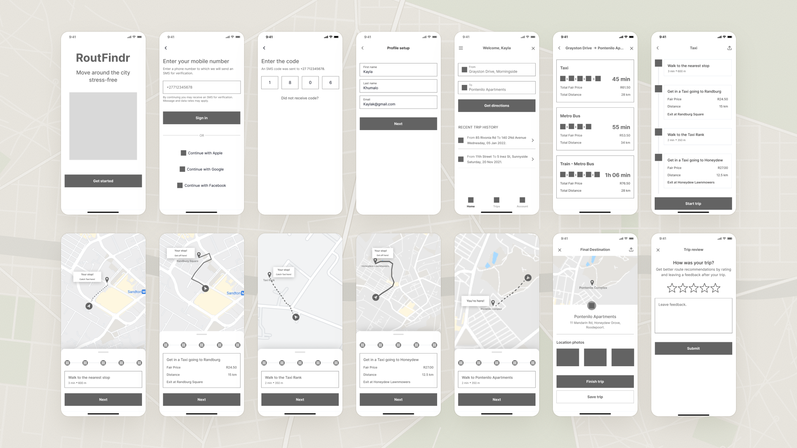
Before designing anything, I wanted to validate that this was even a problem worth solving, and whether other people out there faced it too. I ran 8 phone interviews to understand how people navigate unfamiliar routes and where their navigation breaks down. For the quantitative side, I ran a survey of 22 respondents to check whether the patterns held at a wider scale. The insights from both fed into a persona and an empathy map, then a user flow mapped in Miro. From there, I moved through sketches and wireframes to high-fidelity screens in Figma, designed against iOS guidelines. I closed with remote usability testing on Useberry, where 6 participants worked through 2 core tasks: signing up and getting directions.
Solution
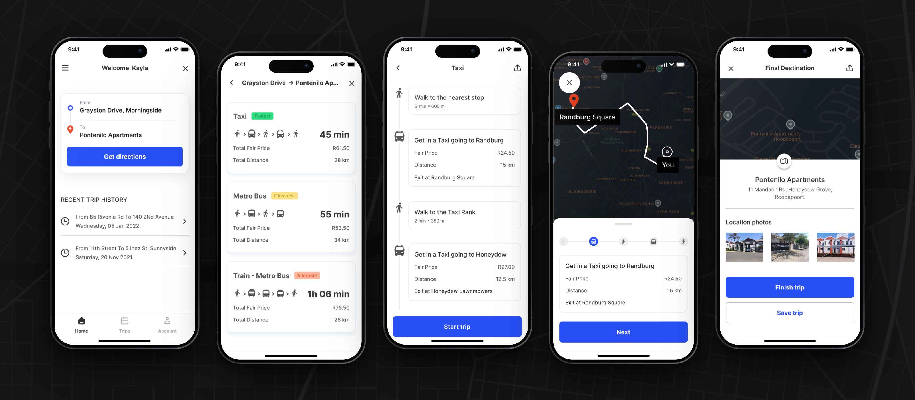
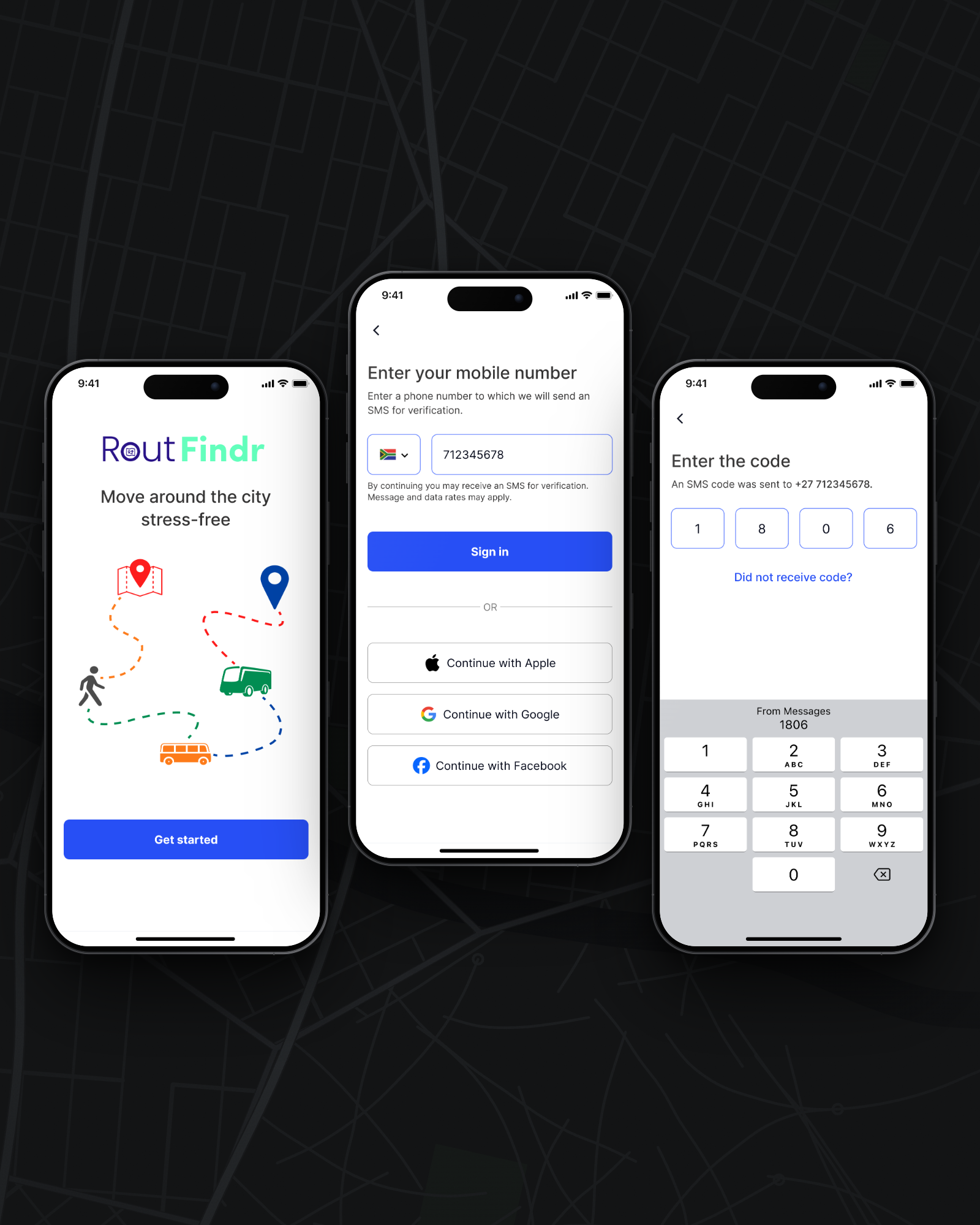
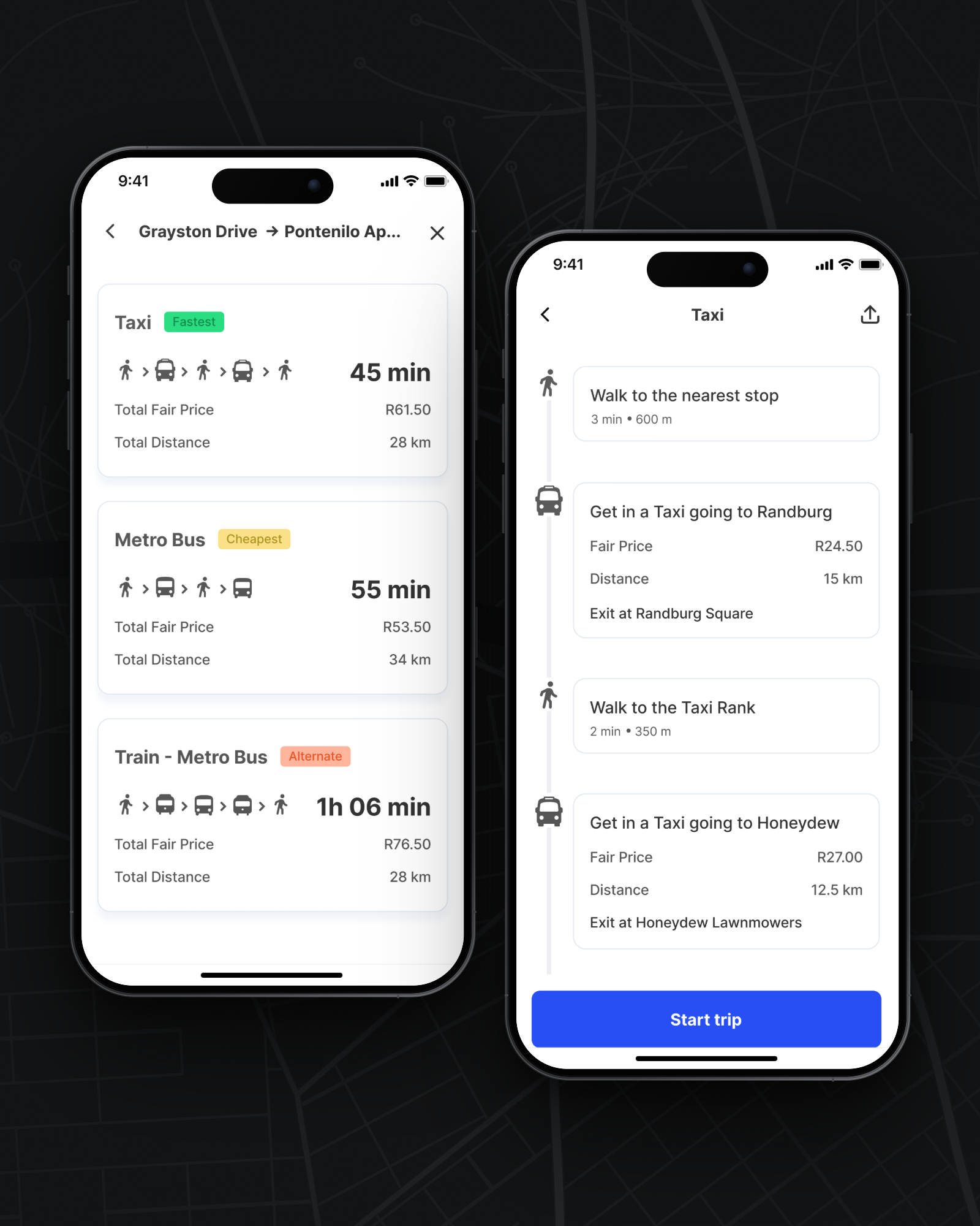
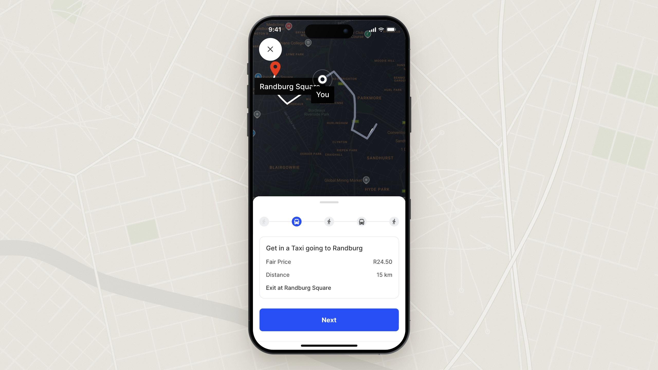
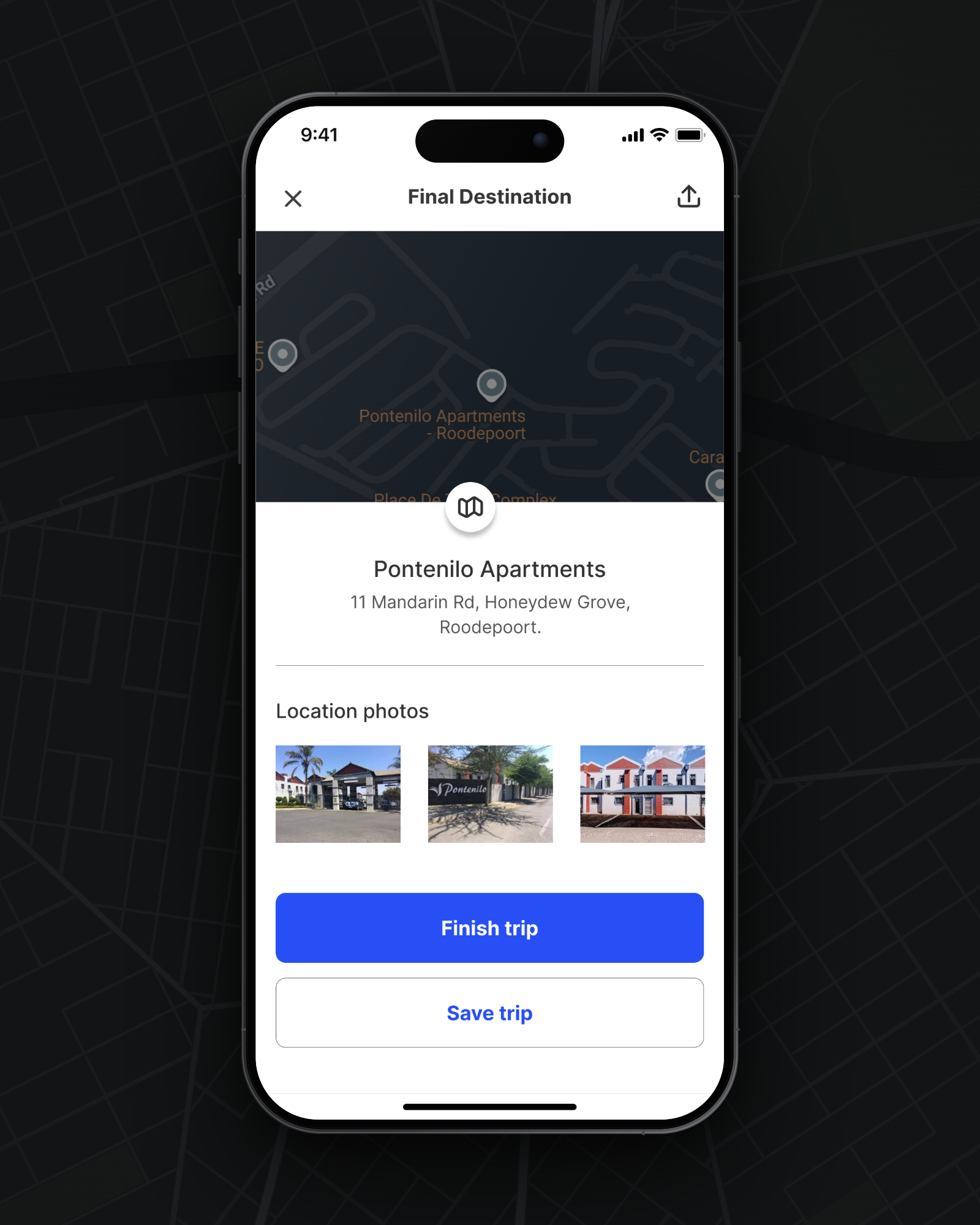
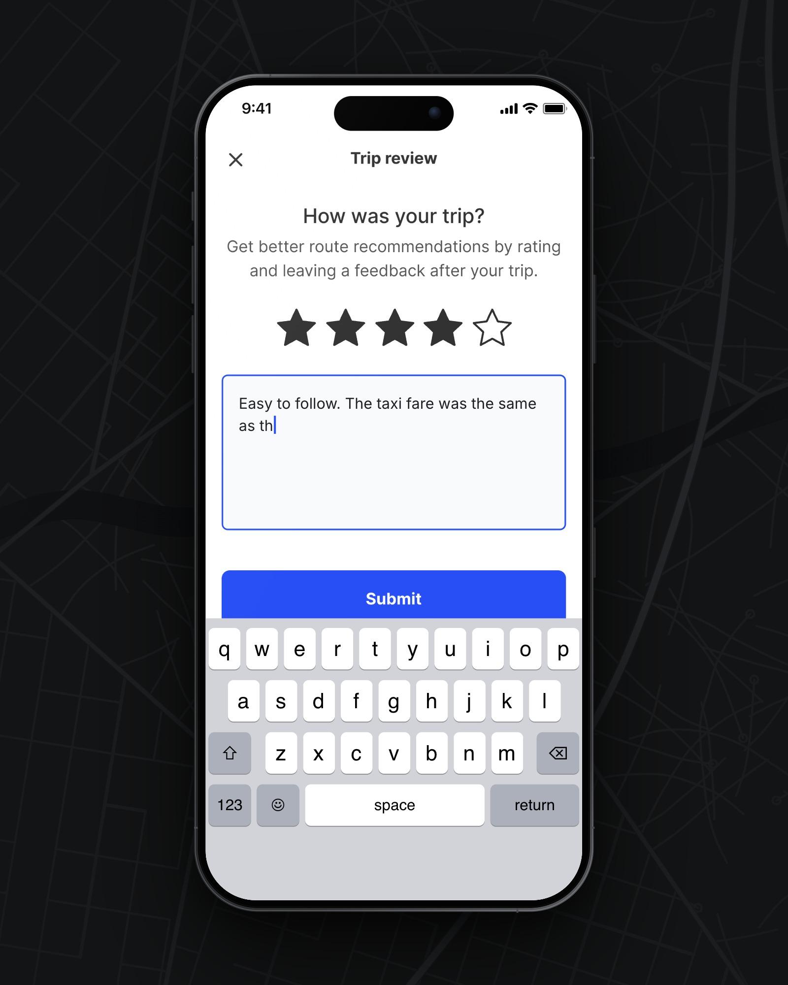
RoutFindr gives public transport directions in language and detail that match how people travel the city. A user signs up with their mobile number, enters where they are going, and gets route options built around the transport available to them. Each route option shows how long the trip will take and what it will cost. Tapping a route option opens its route details, and the trip is then followed on a map one step at a time, up to the final destination. A trip can be saved or shared with someone else, and ends with a short trip review. The interface stays plain, with clear hierarchy at each decision point, because the app is used mid-journey by someone who is already unsure where they are going.
Outcome
Usability testing came back positive. Participants were happy with the navigation, liked that the information felt locally relatable, and found the interface clean and easy to understand. Their feedback also suggested that commuters want an app like RoutFindr. Working solo against a 2-week deadline limited how deep the research could go, but it was enough to ground the design in real behaviour and shape a product that could make a difference to commuters' everyday lives. The tight timeline also improved my self-discipline, and I finished the project in the time set. The roadmap from here covers voice interaction, exploring more use cases, collecting feedback to shape new features, and research into crowdsourced route data.